v1.0 — Launch
July 6, 2026
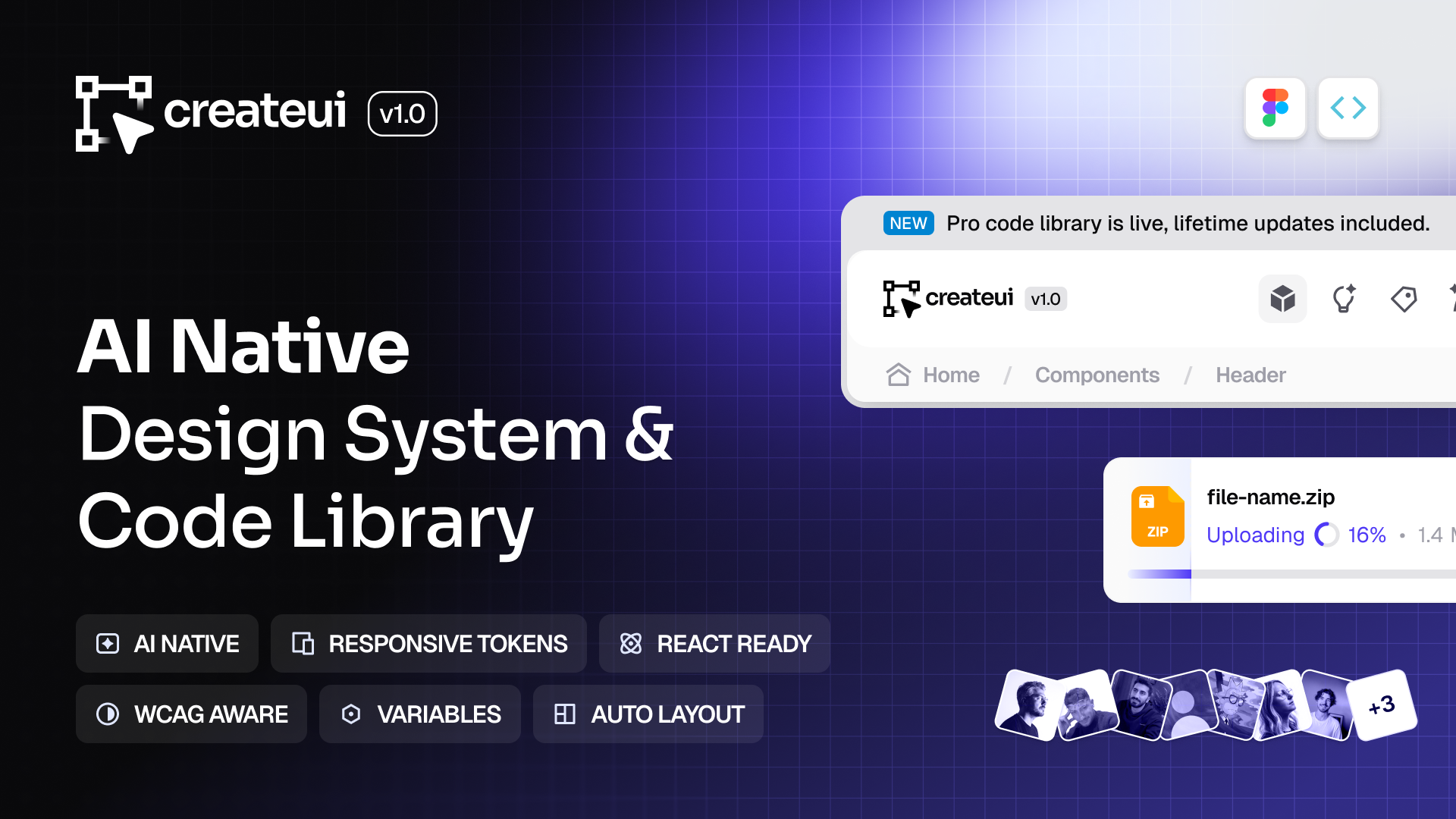
This is the release where Design = Code becomes real. The Pro library ships in code for the first time, at full parity with the Figma system. 19 new components, a rebuilt selection and menu foundation, and a deep pass across tokens, dark mode, interaction, and responsive behavior, across both design and code.
✦ Pro is here
The Pro library ships in code for the first time, at full parity with Figma. These are the components you rebuild on every project, plus richer versions of a few you already use. 13 Pro-only components across overlays, navigation, form controls, actions, and assets, all included for pre-sale customers.
✦ 19 new components
6 free (Stepper, Slider, Tabs, Dropzone, Context Menu, Combobox), 13 Pro (Modal, Command, Popover, Info Tooltip, Alert Banner, Sidebar, Navbar, File Upload, Input Tag, Password Strength, Rating, FAB Button, File Format), plus richer Pro versions of Tabs, Slider, Pagination, Separator, Input Stepper, and Tab Menu.
✦ Rebuilt selection and menus (Code)
Select, Dropdown Menu, Combobox, and the new Context Menu now share one foundation, with better keyboard and screen-reader behavior and a more composable API. Select gained multi-select, searchable options, and a controlled model.
✦ New in existing components
Button now takes leading and trailing content as children, each independently toggleable. Tab Menu leading is a flexible slot. Popover and Info Tooltip expose their content as slots.
✦ System refinements (Design + Code)
Tokens: neutral moved from gray to zinc, primary retuned for contrast, semantic tokens across Buttons and Chips, a new stroke-static variable, and Geist Mono as the default monospace
Dark mode: static colors on Solid Badges and File Format icons, solid Alert Banner inverse badges
Interaction: one shared press interaction across Close Button, Checkbox, Radio, and Button, with deeper hover states and shadows
Responsive: finalized responsive radius and type scales, percentage-based line heights, and refined component-level spacing
✦ Breaking changes (Code)
The leading icon prop is now
leadingeverywhere, replacingleadingIconandleadingIconsButton no longer takes
leadingIconortrailingIcon; pass icons as childrenDialog was removed; use the Pro Modal
Icons moved to the Create UI icon set (
@create-ui/assets/icons)Select and Dropdown selection moved from a single value to keys (
selectedKey,onSelectionChange)
✦ Product
Member Dashboard is now live
✦ Design System
Now 65+ components and 16,800+ variant combinations